

Xandr555
-
Posts
4 -
Joined
-
Last visited
Content Type
Profiles
Forums
Calendar
Store
Posts posted by Xandr555
-
-
А, извините. Сам попробовал сделать, получилось. Просто немного поменял местами блоки css
-
Здравствуйте. Верстаю сайт, в валидаторе firefox выскакивает "parse error" в css для мобильных браузеров. По задумке <span class="phonecpu">текст</span> виден на десктопах, а на мобильных display:none его закрывает. При валидации стилей для медиа-запроса - parse error стиля .phonecpu. В чем может быть причина?
 <nav class="one">
     <ul class="topnav">
      <li><a class="activeone"href="#"><span class="icon-home"></span></a></li>
      <li><a href="#"class="active"><span class="icon-phone">
      <span class="phonecpu">Вызвать мастера</span></span></a>
      <ul class="submenu">
       <li>
        <a href="tel:x-x-x">x-x-x</a>
       </li>
       <li><a href="tel:x-x-x">x-x-x</a></li>
      </ul>
      </li>
      <li class="right"><a class="activeone"href="price.html" id="price">Прайс</a></li>
     </ul>
    </nav>
@media only screen{@media screen and (min-device-width: 360px) and (max-device-width: 740px){
   .wraper{
 margin:0 auto}.demo-content{text-align:center}
.part{max-height:310px;max-height:100%; display:flex;
display: -webkit-flex;justify-content:center}
figure.img-box img{max-width:100%;vertical-align:top}figure.img-box:after{
  border: 2px solid #FF0000}
  .img-box:hover figcaption,.img-box:hover .imgone{transform: scale (0.8); -webkit-transform: scale (0.8);
    -ms-transform: scale (0.8); opacity:1}.phonecpu{display:none}}}
-
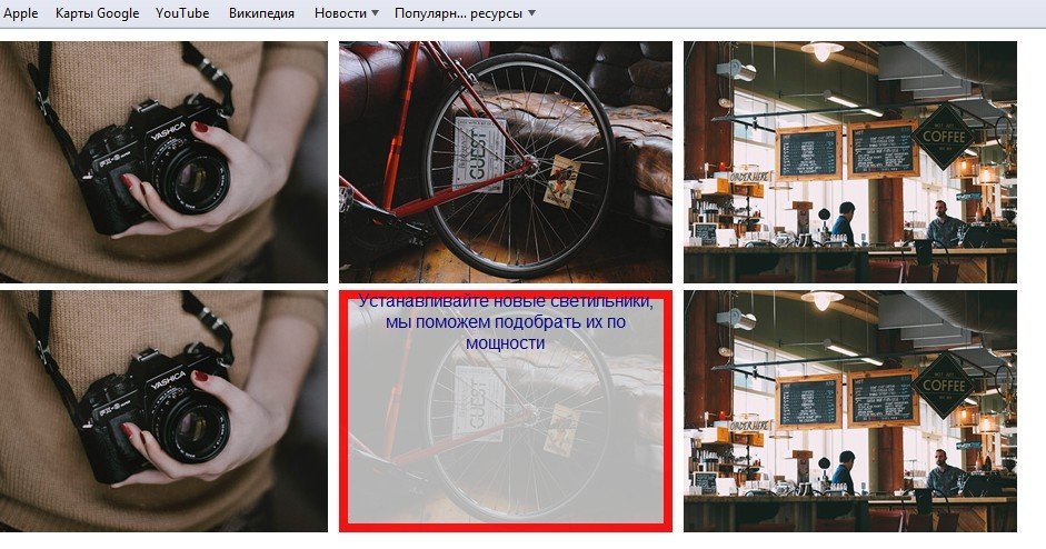
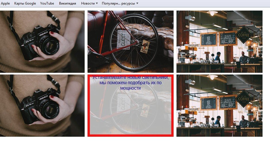
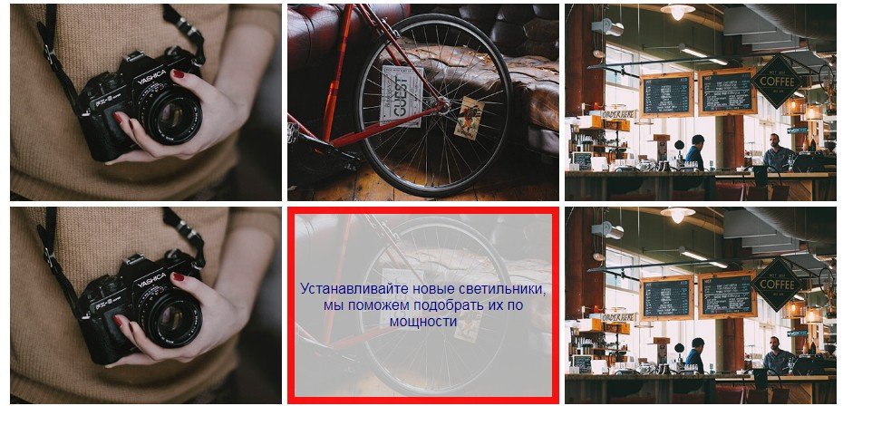
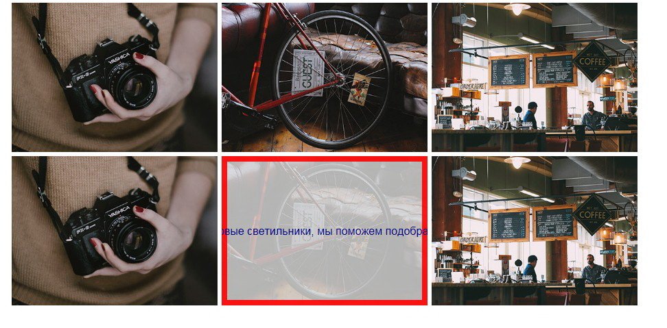
Добрый день. Размещено 2 блока по 3 изображения, отцентрировано flex, по плану при наведении курсора картинка затемняется, сверху появляется описание. Стили работают как задумано только в Chrome и Opera. В Сафари рамка не всплывает, текст не выравнивается. В IE 11 рамка всплывает, текст не выравнивается. Заранее благодарю.
<div class="wrapper">
    <div class="demo-content">
   <div class="part">
        <figure class="img-box">
            <img alt=img src=https://s3-us-west-2.amazonaws.com/s.cdpn.io/331810/sample54.jpg>
            <figcaption><section class="imgone">По Вашему желанию электропроводку можно уложить в ПВХ-короб</section></figcaption>
        </figure>
        <figure class="img-box">
            <img alt=img src=https://s3-us-west-2.amazonaws.com/s.cdpn.io/331810/sample73.jpg>
            <figcaption><section class="imgone">Красиво, эстетично и надежно - наше кредо!</section></figcaption>
        </figure>
        <figure class="img-box">
            <img alt=img src=https://s3-us-west-2.amazonaws.com/s.cdpn.io/331810/sample58.jpg>
            <figcaption><section class="imgone">Такой вариант электропроводки рекомендуем, например, в подсобных постройках</section></figcaption>
   </figure>
    </div>
   </div>
</div>
        <div class="wrapper">
    <div class="demo-content">
        <div class="part">
  <figure class="img-box">
            <img alt=img src=https://s3-us-west-2.amazonaws.com/s.cdpn.io/331810/sample54.jpg>
            <figcaption><section class="imgone">Вмонтированный в стену электросчетчик делает Вашу квартиру более объемной</section></figcaption>
        </figure>
        <figure class="img-box">
            <img alt=img src=https://s3-us-west-2.amazonaws.com/s.cdpn.io/331810/sample73.jpg>
            <figcaption><section class="imgone">Устанавливайте новые светильники, мы поможем подобрать их по мощности</section></figcaption>
        </figure>
        <figure class="img-box">
            <img alt=img src=https://s3-us-west-2.amazonaws.com/s.cdpn.io/331810/sample58.jpg>
            <figcaption><section class="imgone">Мы устанавливаем розетки и выключатели в любой компоновке</section></figcaption>
        </figure>
 </div>
  </div>
  </div>
*, *:after, *:before {
    box-sizing: border-box;
 -webkit-box-sizing: border-box;
 -moz-box-sizing: border-box;
 -ms-box-sizing: border-box;
}


.wrapper{margin:0 auto}

.demo-content {
    text-align: center;
}
.part{max-height:310px;max-height:100%;display:flex;display:-moz-flex;display: -webkit-flex;justify-content:center}

figure.img-box {
  text-align: center;
  position: relative;
  display: inline-block;
  overflow: hidden;
  margin: 3px 3px;
   max-width: 300px;
  width:100%;
  background-color:#DCDCDC;
  -webkit-box-shadow: 0 8px 17px 0 hex(#cccccc), 0 6px 20px 0 hex(#cfcfcf);
  box-shadow: 0 8px 17px 0 hex(#cccccc), 0 6px 20px 0 hex(#cfcfcf);
}
figure.img-box * {
  -webkit-box-sizing: padding-box;
  box-sizing: padding-box;
  -webkit-transition: all 0.2s ease-out;
  transition: all 0.2s ease-out;
}
figure.img-box img {
  max-width: 100%;
  vertical-align: top;
}
figure.img-box figcaption {
    position:absolute;
    top:0;
    bottom:0;
    left:0;
    right:0;
    align-items:center;
    z-index:1;
    display: flex;
 display: -webkit-flex;
 display: -moz-flex;
 display: -ms-flex;
    flex-direction:column;
 -webkit-flex-direction:column;
 -moz-flex-direction:column;
 -ms-flex-direction:column;
    justify-content:center;

    opacity:0;
}

figure.img-box:after {
  border: 8px solid #FF0000;
  position: absolute;
  content: "";
  display: block;
  top: 50%;
  bottom: 50%;
  left: 0;
  right: 0;
  -webkit-transition: all 0.7s ease-in-out;
  transition: all 0.7s ease-in-out;
  -ms-transition: all 0.7s ease-in-out;
  opacity: 0;
}

figure.img-box:hover img {
  opacity:0.2;
}
figure.img-box:hover:after {
  top: 0;
  bottom: 0;
  opacity: 0.9;
}
.img-box .imgone {
 font-family:'Roboto',sans-serif;
    color:#00008B;
 font-size:16px;
    font-weight: 400;

    margin: 0;
    padding:0 10px;

    transform: scale(0);
  -webkit-transform:scale(0);
  -ms-transform:scale(0);
    -webkit-transition: all 1s ease 0s;
    transition: all 1s ease 0s;
 -ms-transition: all 1s ease 0s;
 }
.img-box:hover figcaption, .img-box:hover .imgone {
    transform: scale(1);
 -webkit-transform: scale(1);
 -ms-transform: scale(1);
    opacity: 1;
}
скриншоты прилагаю


Не работает форма обратной связи
in PHP
Posted
Добрый вечер! Подскажите.. Не работает форма, заполнил поля php mail, некоторые синтаксисы не знаю. Код ниже. Скрипт пробовал в хеде и в выложенной вариации, не идет сообщение. Заранее спасибо.