- 0

-
Обсуждения
-
 Актуальные контакты: Telegram: @Nikker_web E-Mail: tarasevich.email@gmail.com Портфолио https://www.behance.net/d4d4186e Разрабатываю дизайн групп в соц сетях, сайтов, приложений, другой дизайн под заказ
 -
Актуальные контакты: Telegram: @Nikker_web E-Mail: tarasevich.email@gmail.com Разрабатываю дизайн групп в соц сетях, сайтов, приложений, другой дизайн под заказ Портфолио https://www.behance.net/d4d4186e
-
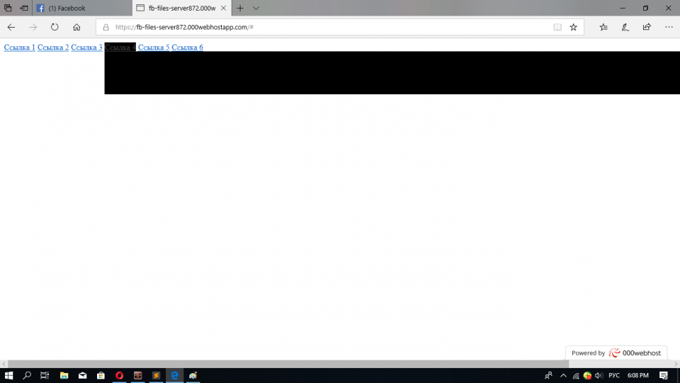
 Доброго всем времени суток. Прошу помощи. Научите принципу изменения футера. Движок Xenforo. Версия 2.2.10. Стиль дефолтный. Что именно нужно в итоге на фото примере. Мой шаблон app.footer less имеет следующее значение. .p-footer { .xf-publicFooter(); a { .xf-publicFooterLink(); } } .p-footer-inner { .m-pageWidth(); .m-pageInset(); padding-top: @xf-paddingMedium; padding-bottom: @xf-paddingLarge; } .p-footer-row { .m-clearFix(); margin-bottom: -@xf-paddingLarge; } .p-footer-row-main { float: left; margin-bottom: @xf-paddingLarge; } .p-footer-row-opposite { float: right; margin-bottom: @xf-paddingLarge; } .p-footer-linkList { .m-listPlain(); .m-clearFix(); > li { float: left; margin-right: .5em; &:last-child { margin-right: 0; } a { padding: 2px 4px; border-radius: @xf-borderRadiusSmall; &:hover { text-decoration: none; background-color: fade(@xf-publicFooterLink--color, 10%); } } } } .p-footer-rssLink { > span { position: relative; top: -1px; display: inline-block; width: 1.44em; height: 1.44em; line-height: 1.44em; text-align: center; font-size: .8em; background-color: #4682B4; border-radius: 2px; } .fa-rss { color: white; } } .p-footer-copyright { margin-top: @xf-elementSpacer; text-align: center; font-size: @xf-fontSizeSmallest; } .p-footer-debug { margin-top: @xf-paddingLarge; text-align: right; font-size: @xf-fontSizeSmallest; .pairs > dt { color: inherit; } } @media (max-width: @xf-responsiveMedium) { .p-footer-row-main, .p-footer-row-opposite { float: none; } .p-footer-copyright { text-align: left; padding: 0 4px; // aligns with other links } }
 -
 Нужны сайты с примерами верстки, типа https://css-tricks.com/. Типовые приемы и нестандартные на все случаи жизни. Накидайте ссылок.
 -

By Katerina23 · Posted
Да, подходит. Спасибо.
-
Question
Неугомонный
Как растянуть блок по размеру экрана а не так чтобы он улетал за экран?
Edited by НеугомонныйLink to comment
Share on other sites
17 answers to this question
Recommended Posts
Join the conversation
You can post now and register later. If you have an account, sign in now to post with your account.
Note: Your post will require moderator approval before it will be visible.